Log-in required.

You are trying to access the internal Editor Foundations design system.
Sign-in with your Unity Google account to continue, or visit the public site.

Implementation references

Scripting API and implementation references.

IMGUI
UI Toolkit

Overview

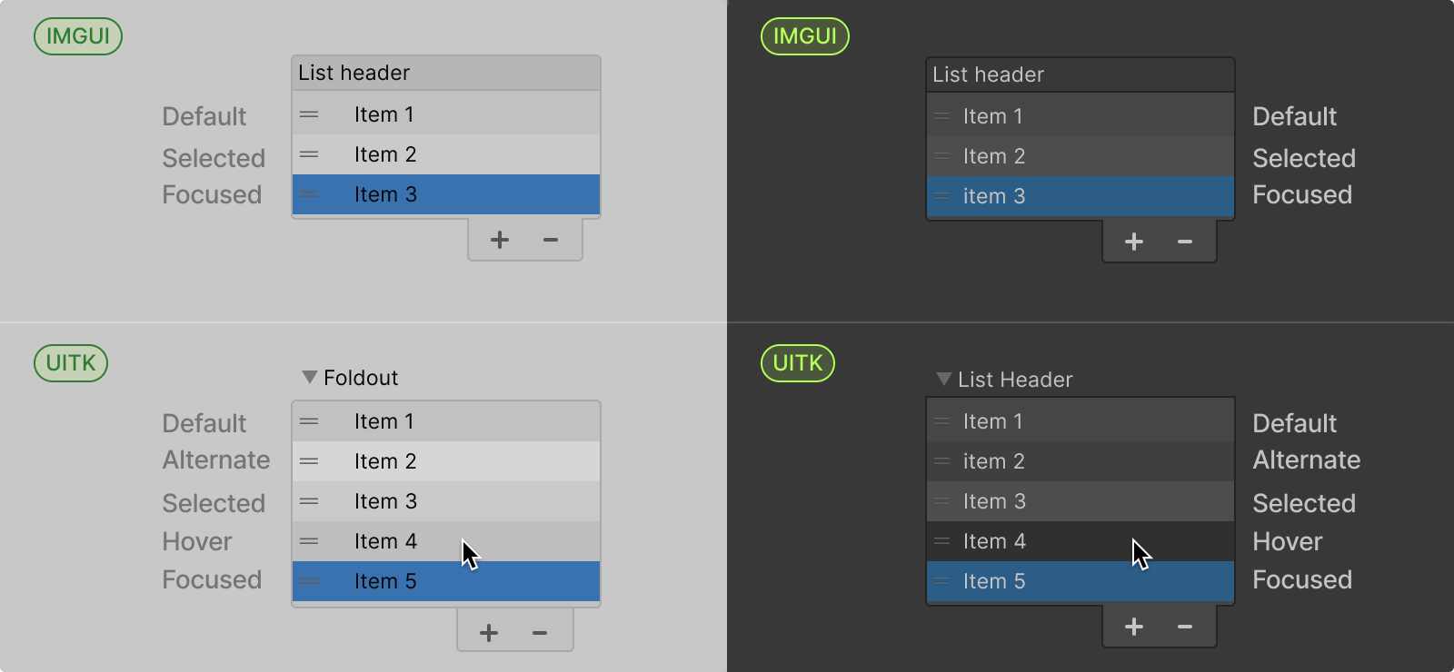
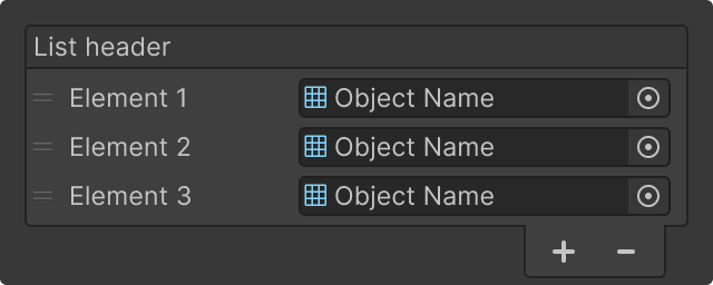
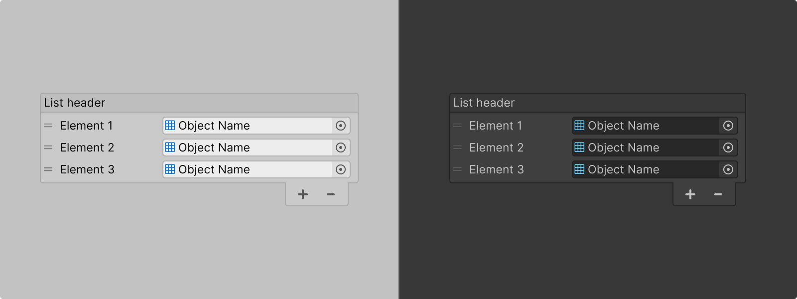
A reorderable list view in light and dark themes featuring the header and add & remove buttons
A reorderable list view under light and dark themes featuring the header and add & remove buttons.

A ReorderableList is an IMGUI component that displays a scrollable list of items with built-in support for reordering, adding, and removing elements. It's commonly used in Inspectors and IMGUI-based tools to manage serialized collections from MonoBehaviours and ScriptableObjects.

For UI Toolkit: If you're building UI Toolkit interfaces, use ListView instead. See the list view guidelines for basic list functionality, or continue reading this page to understand how to make ListView equivalent to ReorderableList.

When to Use

  1. You're extending an existing IMGUI editor (OnInspectorGUI, OnGUI) that you're not porting to UI Toolkit
  2. You need a list inside an IMGUI-only surface, such as a custom PropertyDrawer that still returns IMGUI
  1. You need to cover basic list scenarios: Simple list with selection. See the list view guidelines for recommended configuration
  2. You need to cover advanced list scenarios: You need size field editing, custom headers, multi-field items, or complex layouts
  3. You're building UI Toolkit interfaces
Icon of a red triangle to indicate a message of warning.
Unity Internal Note
UI Toolkit should be the default choice for any new UI implementation.
Use other components when:

Reorderable List APIs

ListView Configurations (UITK)

Option
Description
Default
fixedItemHeight
Height of each item in pixels
22px
showBorder
Display a border around the list
Off
showAlternatingRowBackgrounds
Alternate row background colors: None, ContentOnly, or All
None
showAddRemoveFooter
Show + and - buttons at the bottom
Off
showBoundCollectionSize
Show a TextField at the top to edit collection size directly (requires foldout header)
On
showFoldoutHeader
Display a foldout header (toggle to expand/collapse list)
Off
headerTitle
Label text for the foldout header (only visible when showFoldoutHeader is On)
Empty
reorderable
Allow users to drag items to reorder
Off
reorderMode
Simple (only blue drop line) or Animated (with drag handles)
Simple
selectionType
List item selection mode: None, Single, or Multiple selection
Single

ReorderableList Configurations (IMGUI)

Option
Description
Default
elementHeight
Height of each item in pixels
21px
displayHeader
Display a header with the field name (no foldout)
On
displayAdd
Show (+) button to add items
On
displayRemove
Show (-) button to remove items
On
draggable
Allow users to drag items to reorder
On

Guidance

ReorderableList vs ListView

ReorderableList (IMGUI) and ListView (UI Toolkit) serve similar purposes but have different out-of-the-box capabilities.
Here's how they compare:
Feature
UI Toolkit ListView
IMGUI ReorderableList
Item Layout
Full control via makeItem/bindItem callbacks
Display serialized objects (limited inline multi-field layout)
Visual Options
Border, alternating rows, add/remove footer, size field
Border, add/remove footer
Add Item Behavior
Adds items with default/empty values
Duplicates the last item's values
Size Editing
TextField to edit collection size directly (showBoundCollectionSize)
Add/remove buttons only (customizable header required)
Reorder Modes
Simple without drag handles(but with blue drop line) or Animated (withdrag handles)
Single mode (drag handles only)
Selection
None, Single, or Multiple selection modes (via selectionType enum)
Selection always enabled; toggle multi-select via multiSelect property
Size Editing
TextField to edit collection size directly (showBoundCollectionSize)
Add/remove buttons only (customizable header required)
Footer Position
Fixed at bottom (always visible)
Scrolls with content (may hide)
Header
Collapsible foldout header (showFoldoutHeader)
Static header label only (displayHeader)
Styling
Full USS/flexbox support
Limited (GUIStyle only)

Performance

  • Keep item templates lightweight.
  • Keep in mind that items are pooled and reused across indices.
    • Reset all states in bindItem: don't assume the item is fresh; clear any properties that changed before.
    • Use unbindItem/destroyItem callbacks for cleanup when an item is no longer needed.
  • Avoid complex layouts with many nested elements.
  • Test with realistic data counts.

Formatting

Anatomy and layout

Reorderable List
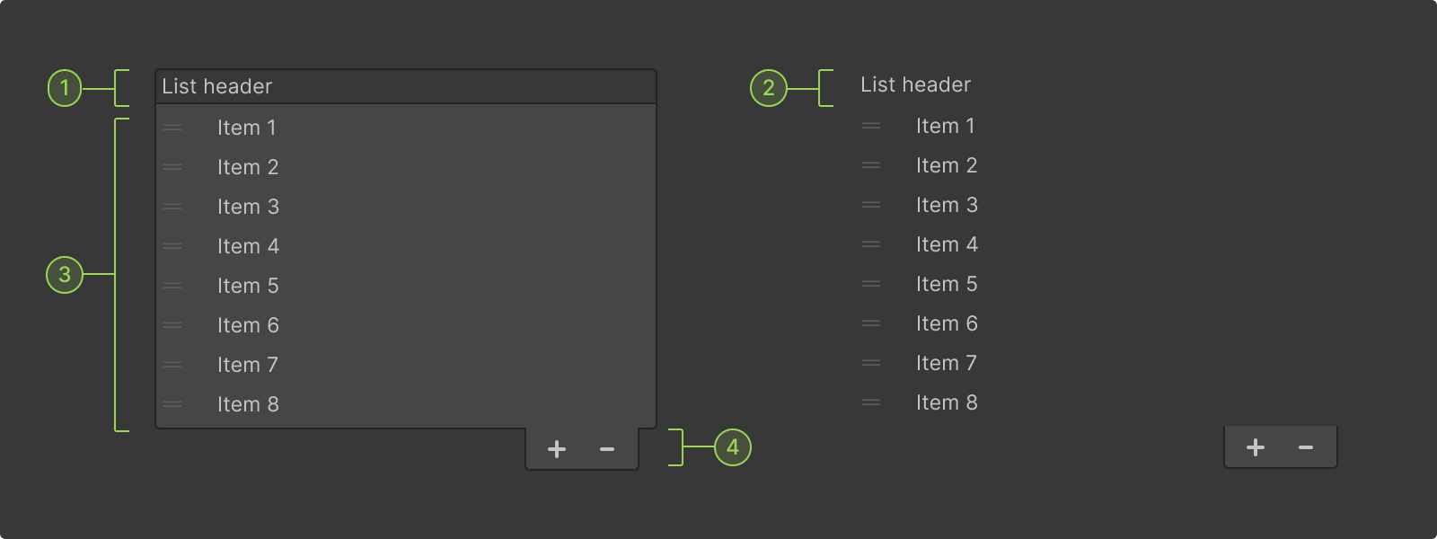
Anatomy of a Reordable List and its key parts

As seen in the configurations section, Reorderable Lists come with built-in options:

1. Display a list header/title.
2. Display list without a border (hiding the border will also remove the background and header colors)
3. Allow users to add and/or remove items from the list.
4. Alllow users to reorder items form the list.
Important Notes
  • Single-field items (IMGUI): ReorderableList displays serialized objects and works best with simple data. Multi-field layouts require custom drawing code
  • Footer styling: If using add/remove buttons, enable the border to create visual continuity. The footer styling is designed to align with the list border
  • Footer visibility (IMGUI): Buttons may scroll out of view in fixed-height containers. Keep the list height flexible or use UI Toolkit
List View
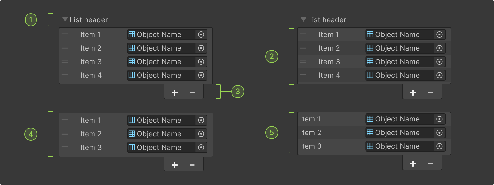
Anatomy of a List view with reordable option and its key parts

List View (UI Toolkit) has similar configurations that come as built-in options, which makes it a great alternative for Reorderable Lists :

1. Display a list header/title (which is using a foldout).
2. Rows can use alternating row colors to ease reading and input control association.
3. Allow users to add and/or remove items from the list.
4. The list can be displayed without a border
5. Alllow users to reorder items form the list (which can be with or without handles).
Important Notes
  • Footer styling: If using add/remove buttons, enable the border to create visual continuity. The footer styling is designed to align with the list border
Items Spacing
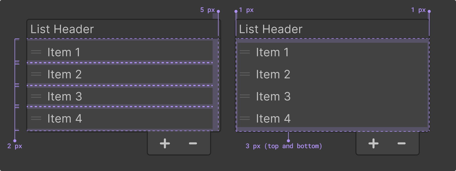
Item spacing details within lists.

Spacing details

  • Item spacing: Each item has 2px of top and bottom padding, creating a 4px spacing between each item. Each item also has a 5px padding to the right.
  • List spacing: List container has 3px top and bottom padding.
  • Control spacing (UI Toolkit): When composing items with multiple input fields, individual components have built-in 3px left/right margins, creating 6px spacing between adjacent controls

Colors

Different colors used in reorderable lists

The following UI Toolkit theme variables influence ListView appearance.

For IMGUI ReorderableList: Colors are defined by the GUISkin system using texture files rather than CSS variables. In the end, ReorderableList will use the same or very similar, colors.

Values depend on the active Editor theme (Light or Dark):

1. List view item backgrounds
--unity-colors-alternated_rows-background
The alternate background color for views with alternating row colors
#CACACA
#3F3F3F
--unity-colors-button-background
The background color for a button control
#E4E4E4
#585858
--unity-colors-highlight-background
The background color for selected items or selected text
#3A72B0
#2C5D87
--unity-colors-highlight-background-hover
The background color for line items when the mouse pointer hovers over them
rgba(0, 0, 0, 0.0627451)
rgba(256, 256, 256, 0.0627451)
--unity-colors-highlight-background-hover-lighter
The background color for an item with a line specific background color when the mouse pointer hovers over them
#9A9A9A
#5F5F5F
--unity-colors-highlight-background-inactive
The background color for selected items or selected text when the control does not have focus
#AEAEAE
#4D4D4D
2. List view item label
--unity-colors-default-text
The default text color
#090909
#D2D2D2
--unity-colors-default-text-hover
The default text color when the mouse pointer hovers over the text
#090909
#BDBDBD
--unity-colors-label-text-focus
The text color for a label when it has focus
#003C88
#81B4FF

Code samples

Code references