Designing interactions
Control states
- Consider using tooltips to inform users when a control is disabled, or hide them from the interface
- Consider use cases for navigation through keyboard input, and ensure your functionality receives focused states when actively receiving input
- Consider using pressed states for binary action controls, depicting the function as "active", such as toggle buttons
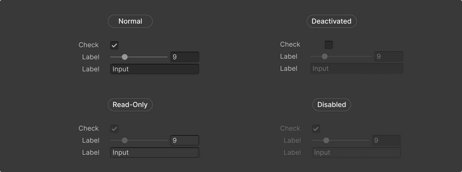
Interaction availability: Read-only, disabled, deactivated
Interaction Matrix
Disabled
❌
❌
❌
❌
❌
⚠️
"This option is unavailable because..."
Read-only
✅
❌
✅
✅
❌
✅
"This data is read-only. It can be viewed or copied but not modified."
Deactivated
✅
✅
✅
✅
✅
✅
"Activate this feature to use..."
Clarity, Consistency and Availability
To ensure clarity and consistency when using inactive, read-only, or disabled states, it’s important that disabled is used sparingly, with read-only being the most commonly used state.
Disabled elements will be ignored by screen readers therfore, disabled items have to be considered “unimportant” information.
Grayed-out elements in most software applications (including Unity) imply that they are "disabled," "unavailable," or "non-functional.", but will also often be used to represent “locked”, “out of range” or even be used for “placeholder” purposes.
Navigational elements (Foldouts, scrollbars, dropdown menus, tabs,...)
If the content overflows or is subdivided, navigational elements must remain interactable.
Most of the time, users need to be able to view all the content. Only in rare circumstances where the whole window or panel section of the interface is disabled should navigational elements also be disabled.
Navigational elements are still are still available even if content is not.
Visual cues
Use visual indicators to hint at ongoing interactions:
- Show the target of a drag and drop action, by blue lines in list views, or with blue background highlights in folder views
- Highlight the applicable drop zones when the target area accepts the drop action. (e.g., overlays, object pickers)
- Design interaction cues for the source , dragged item and target elements considering their environment
Blue line showing the target of a drag and drop action in tree view.
Visual cues in UI Builder:
Overlays drop zone styling:
Rounded corners
With most controls and containers the Editor interface utilizes rounded corners to hint at interactiveness.
Rounded corners should be used sparingly, and be reserved only for interactive elements, not for paneling or containers.
Element containers
Placing your elements in containers will hint at interactiveness, such as click or drag actions.
Do not place static elements, such as status tags or read-only elements in containers.
Underlining
Blue link labels are reserved for directing users out of the Editor. These links are underlined on hover to reduce clutter in windows with a lot of external links.
Do not use underlined links as a default/idle state.
Hiding vs disabling elements
When a control is disabled, it is slightly transparent and stops receiving input. When a control is hidden, it is no longer in the interface.
When should the controls be disabled:
- If the input value of a control is relevant, but not editable, the control should be disabled. For example, a control whose value is automatically determined under some condition should appear disabled if its value might still be used by the component or some other system
- If the control is available under normal circumstances, but is not available right now due to an error or event, disable the control to indicate that it exists, but it is disabled; provide a tooltip explaining the reason for the disabled status
When should the controls be hidden:
- If a control is only active in very rare circumstances it should be hidden; do not show the user a control that can’t be used in most cases
- Hide input controls (e.g., text fields, color fields or popups) when the value shown is currently irrelevant and not used
- Buttons should never be hidden, because there is an expectation of persistence for them
- When you are hiding controls based on the value of another control, always place the hidden control somewhere below the control that triggers the hiding; ideally, the hidden control should be on the next line
Invalid entry
Input / Numeric fields
When a value that is invalid for the property is entered, input field disallows the input and reverts to last valid value entered.
Control interaction states
Control interaction states are the visual representations of interactive controls in the Editor.
State variables
Most interaction pseudo-states are implemented using color variables so they can be easily changed.
For example, when you see a variable name with the hover pseudo-state, it means Unity uses the variable in styles that affect elements when a user hovers the mouse pointer over them.
Example: --unity-colors-toolbar_button-text-hover
A variable name can have more than one pseudo-state. Multiple pseudo-states appear in alphabetical order, separated by underscores.
Example: --unity-colors-toolbar_button-text-focus_selected
Unity variable names can have any combination of the following pseudo-states:
A user hovers over a control
A control is pressed and active (eg.
buttons)A control is selected (eg. selected items in
tree views)
A selected control does not have focus
Hover state
A hover state communicates when the cursor is paused over an interactive element.
- Example variable --unity-colors-toolbar_button-text-hover
- Hover states are visually indicated by lighter fill colors in action controls, and lighter border colors in input controls
- Hover states can be combined with focus, checked, pressed, or selected states
- Visual elements can display a tooltip on hover state by using the .tooltip property
Focus state
A focus state communicates when an interactive element is highlighted via a mouse click or keyboard.
- Example variable --unity-colors-button-background-focus
- In most cases, focused elements are highlighted in blue; the use of blue in the Editor is reserved for controls that can be focused, pressed, or selected
- Focus states can be hovered
- Focused controls can receive keyboard inputs
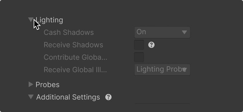
Disabled state
A disabled state means the element is unavailable for interaction due to a condition (e.g. missing permissions, a pending process). It prevents users from attempting actions that would lead to errors or undesired outcomes. Not to be confused with Read-only or Deactivated states.
A disabled state communicates an element is not interactive and not accepting user input.
- Example variable --unity-colors-slider_groove-background-disabled
- In most cases, disabled elements have a 40% alpha value, including their contents such as labels and icons
- Disabled states do not accept clicks or direct input
- Disabled elements do not respond to hover states (no cursor change, no visual feedback)
- Provide tooltips and potentially help boxes to give more context about why a controls is disabled; see help boxes and errors & messaging for more information
Read-only state
The read-only state is not an official pseudo state in code, but an essential interaction state that gives important cues to users.
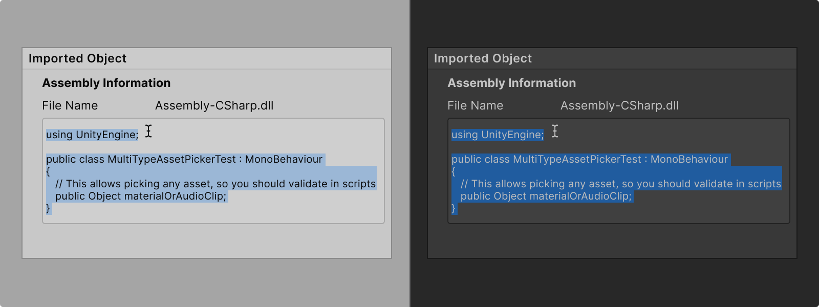
A read-only state means the content of the element is viewable but not editable by the user. The data is relevant and often important for context or information, but the user simply cannot modify it directly and may never become interactable.
Read-only controls are typically used for properties that are dynamically calculated or derived.
- Change the cursor to the I-beam cursor to indicate text selection is possible and not click or drag
- In most cases, the background is the same as the window background to indicate the input is not editable anymore
- Consider changing the control entirely and only show text directly on the window background, without an element container
- Users must be able to select and copy the content of Read-only elements
- Users must be able to focus on read-only elements (e.g. via keyboard tabbing)
- Read-only elements must be accessible by screen readers
Deactivated state
The deactivated state is not an official pseudo state in code, but an essential interaction state that gives important cues to users.
A deactivated state means the element or feature set is temporarily toggled-off due to the current context.
Sometimes, UI elements need to remain available to allow users to make changes while the system is "off," so that when it is turned back "on," the updated configuration is applied.
Deactivated elements do not have a distinct style. However, they consistently feature a clear toggle that indicates to users the particular function or section they are about to turn on or off.
- Use distinct icons or toggles (e.g., eye icon for show/hide, checkbox for true/false) to manage the Activated/Deactivated state.
- Group elements logically to show they are controlled by the toggle, using indentation or borders.
- Provide tooltips and potentially help boxes explaining that changes take effect upon reactivation; see help boxes and errors & messaging for more information
Checked (on/off) states
Binary controls like toggles, and passive input controls can be checked to communicate their on / off status.
- Example variable --unity-colors-toolbar_button-background-checked
- Checked states are used to communicate the active option from a binary set
- Checked states are reserved to be used for on / off inputs; use pressed state to communicate when a control is active
- Input controls can represent checked state with icon change (toggles)
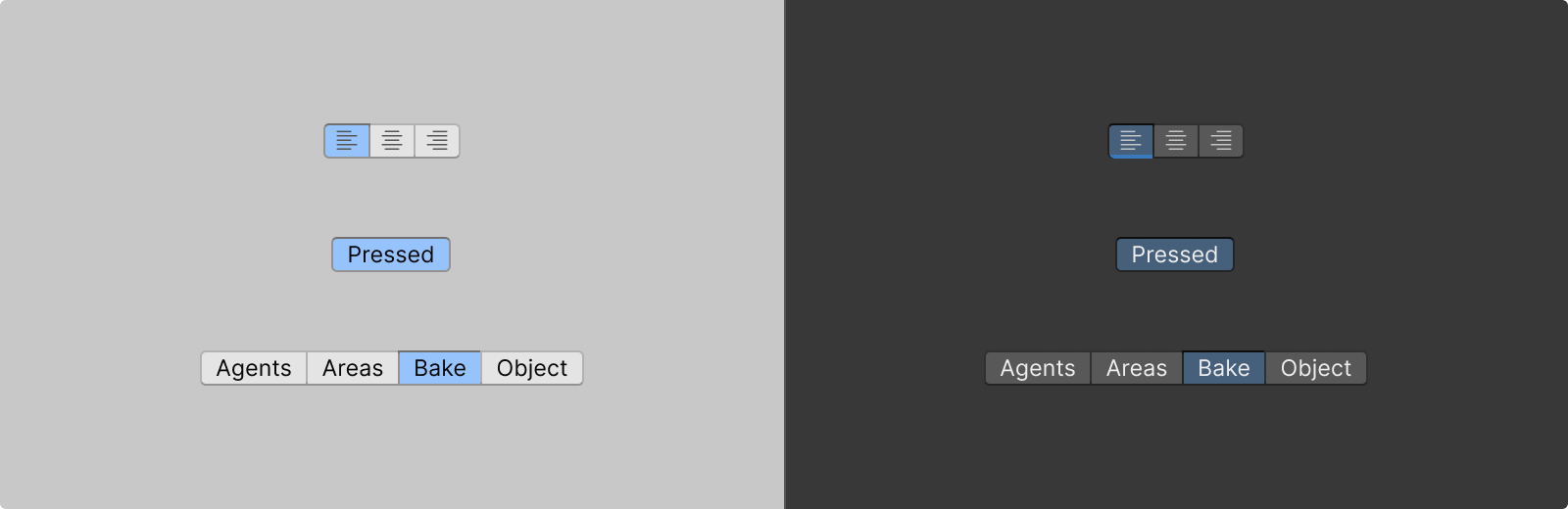
Pressed (active) state
A pressed state communicates when a control is pressed and active (eg. buttons, toggle buttons)
- Example variable --unity-colors-button-background-pressed
- Pressed states are visually indicated by blue highlight fill colors and can be emphasized by border colors

Which controls require a pressed state?
Only elements that perform binary actions require a pressed state, such as toggle buttons.
Highlighted (selected) state
Highlighted parts of the UI, such as text selections or selected items in list views or tree views.
- More than one highlighted state can be present at a time
- Highlighted states can often be dragged
- Example variable --unity-colors-highlight-background
Interaction methods
The Editor allows the standard desktop interaction methods across the native interfaces.
Input devices to consider:
- Mouse
- Keyboard
- Screen readers
Right-click
Most Editor windows support right-click actions.
Throughout the Editor, right-click is reserved for opening context menus. Context menus are dependent on the clicked element and can show various options based on the workflow.

Right click on runtime windows
Note that runtime applications such as Scene and Game views do not support right click actions.
Drag and drop
Drag and drop interactions allow users to add, duplicate, move and reorder content within the Editor windows, and assign and reorder objects and assets to certain controls.
Editor drag & drop operations.
Docs ->
Adding
Users can add assets and controls to panels or canvases, by dragging them from the source and dropping in the target.
Note that the mouse cursor changes to “Copy cursor" while adding an item.

For example, Project window allows users to add an asset by dragging and dropping it into the target folder.
UI Builder also allows dragging a control from the UI Builder library into the viewport or the hierarchy windows.
Duplicating
Similar to adding, users can duplicate (copy) assets by holding ALT and dragging the asset from the source and dropping in the target. Both dragged item and the target are highlighted while dragging.
Note that the mouse cursor changes to “copy cursor" while adding an item.
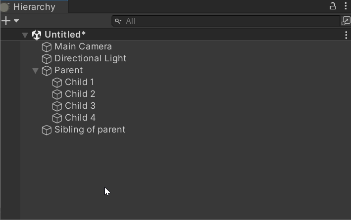
Moving tree view items
Tree view allows users to:
- Reorder an item in its own hierarchy by dragging vertically
- Move an item in or out of a parent item or folder by dragging horizontally towards nesting target
- View the target hierarchy with a blue circle at the beginning of the drop line

Setting up tree view drag and drop behaviors in IMGUI
Assigning objects
To assign a reference to a property, drag and drop a compatible GameObject or Asset onto the property field in the object field control.
Overlay positioning
Overlays can float freely or be dragged to dock on the edges or corner of their parent windows. A container’s position is adjusted by using the dragger.
- Target drop zone: While dragging a container, the target drop zone shows where the container can be docked by highlighting the target area
- Ghost drop zone: While dragging a docked container, the ghost drop zone shows where the container currently is by highlighting the shape of the container in its current location
The shapes of target and ghost drop zones are displayed differently depending on the location of the overlay container / target.
- Corner drop zone: Corner drop zones are used to highlight corners of the window where a container can be docked; they appear as a square blue layer in the corner of the container the overlay is being dragged into
- Edge drop zone: Edge drop zones are used to highlight edges of the window where a container can be docked; they appear as a thin blue layer along the edge of the container the overlay is being dragged into
- Toolbar drop zone: When a container is being dragged into a toolbar, the position of the target is highlighted within it

Overlays
For more information on overlay drop zone styles go to
Overlays ->Resizing windows and panels
Throughout the Editor, default windows are resizable no matter if they are docked or not.
When building your feature, design your layout to adapt to various sizes.
Note that the mouse cursor changes to “resize cursor" while dragging the edges of the panel.
.png)

Mouse cursors
The Editor utilizes system-provided cursors. Avoid introducing custom cursors, unless your feature demands it.
Keyboarding
In the context of accessibility, the term “keyboarding” refers to the ability to navigate a user interface entirely by keyboard. It should be possible to access all areas of the user interface through keyboarding without the need for special knowledge of shortcuts or hotkeys.
Common keyboard shortcuts:
- Tab Should move the user through the interface from top left to bottom right in a logical, predictable order; a proper indication should highlight the element in focus
- Shift + Tab Should reverse the direction of tabbing in the same logical order
- Ctrl + TabShould move the user to the first open tab in each window group
- Spacebar Should expand dropdown menus, activate a button, check/uncheck a checkbox, or perform “click and hold”; in a page, the spacebar should scroll down a screen at a time
- Shift + Spacebar In a list, should scroll up a screen at a time
- Arrow keys Should cycle through dropdown content; in a page, arrow keys should scroll in four directions
- Esc Key Should close a dropdown menu or dismiss a dialog
- Enter or Return Should activate a link or a button, or select an autocomplete option


