Overview
- Tabs are used to navigate between different panels of content that should be shown within the same context / viewport (eg. staying in place while alternating between panels),
- Tab contentContainer can hold labels, icons, and any type of content inside,
- Tabs can be modified to allow the user to close or reorder tabs in the tab view.
When to Use
- Tabs can be used to organize content that should be shown within the same context,
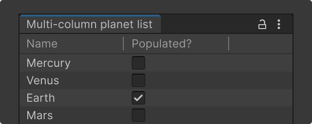
- Don’t use tabs when users need to compare the content between different panels, instead use Multi-column View control.
- Use tabs only when the content can be logically chunk together so users can easily predict what they'll find when they select a given tab within the context.
- If you don't find clearly distinct groupings, then tabs are likely the wrong interface control for managing your content. (Read more on NN group ->)

Looking for Window Tab or Tab Well?
Window tab and tab well guidance has moved under Windows. This page is about the tabbed segmentation control in UITK framework.
Upgrading Legacy Solutions
It is recommended to update existing solutions to the new Tabs API, including toggle button combinations (as pictured above) as previously used in IMGUI framework.
Tab APIs
Tab
A Tab has a header that can respond to pointer and mouse events. The header can hold an icon, a label, or both. The Tab content container can hold anything inside of it giving more flexibility to customize its layout.
Constructor: Creates a tab to organize content on different screens.
Docs ->
Indicates whether this Tab is interactively closeable by the user.
Docs ->
Callback for the tab when it is successfully closed.
Docs ->
This event is called before a tab is closed. Return true if the tab can be closed.
Docs ->
The icon that is displayed in the Tab’s header.
Docs ->
The string that is displayed in the Tab’s header.
Docs ->
Callback for the tab when this is interacted with.
Docs ->
The VisualElement representing the Tab’s header.
Docs ->
TabView
A tab view provides additional functionality to the Tab. It allows a group of tabs to interact between each other by hiding the inactive tabs and displaying the active one. Additionally, it adds the ability to re-order the group of tabs.
Constructor: Creates a tab view that groups a one or more Tab elements.
Docs ->
The current active Tab within a group of available tabs.
Docs ->
Callback for when the active tab has changed.
Docs ->
Indicates whether the tabs inside the TabView can be reordered interactively by user.
Docs ->
Guidance
Content best practices
- Tab labels should be 1–2 words. Short labels are more scannable.
- When used within Inspector, ensure the tab view fits within minimum inspector width (275 pt) and avoid using more than four tabs,
- Do not use ALL CAPS for tab labels.
- Avoid the disabled state. If a user cannot use it, remove it from the tab.
Reorderable tabs
reorderable property can be used to add dragging support to tabs in the tab view. The default value is false. Set this value to true to allow the user to reorder tabs.
For reorderable tabs, it is important to keep the view-data-key unique for the TabView and Tab elements inside of it. The view-data-key helps store the state of the tabs such as the order and state. By having an empty view-data-key, which is the default value, the state of the tabs will not persist when reloading the document.
Indicates whether the tabs inside the TabView can be reordered interactively by user.
Docs ->


