A button communicates an available action in the interface and initiates the action indicated.
UIT
IMGUI
A color field allows the user to select a color and an associated alpha value to define the color’s transparency.
A dropdown is a clickable menu element that displays multiple related action options or settings.
Foldouts are collapsible sections of a user interface that hides or reveals the elements it contains.
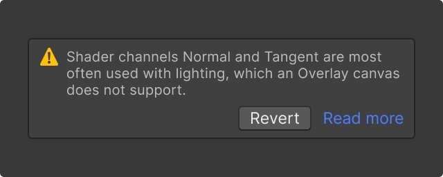
Help boxes are used to communicate conditions, events or warnings and errors about controls or content in a window.
Labels are used for identifying input controls in an interface.
A list view control is a vertically scrollable area that displays a flat list of items.
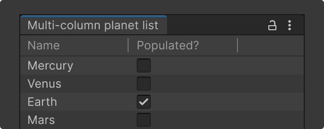
Multi-column view enables the display of multiple columns in using tree or list view controls.
A numeric field is an input field that allows users to enter numbers for calculations or for precise settings.
An Object Field is a control where the user can assign an object or asset to a subject.
A progress bar linearly displays the progress between a lower and upper bound value.
Radio buttons allow users to select a single option from a set.
Scroll view allows for vertical and horizontal of its contained views.
A search field is an input field that allows users to enter text to be searched for.
Sliders allow for quick manual adjustments while displaying changes live.
Tabs help organize and group content across segmented panels in the same viewport.
A Text Field is an input field that allows users to enter text.
Toggles are components that allow a user to make binary choices by selecting a box.
Toolbars allow the grouping of UI elements to improve access to important actions.
Tooltips display contextual information about an element when users hover over it.
A tree view control is a window that displays a hierarchical list of items.


