


Project Settings & Preferences
Project Settings and Preferences windows allow users to configure their projects and customize their Editor experience.

Project Settings and Preferences windows allow users to configure their projects and customize their Editor experience.
Do verify that page naming follows conventions.
Do check that frequently-used settings have contextual access.
Do ensure proper grouping using foldouts.
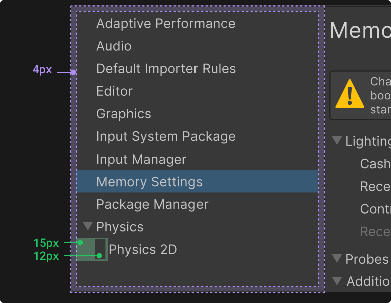
Do confirm visual spacing matches specifications.
Do add documentation access points.
Parameters that affects the whole Editor experience, or most of it’s windows, should be placed in the General page of the Preferences window.
Don't put tool-specific options here (e.g., Hierarchy view options).
Create categories grouping, using foldouts, for settings that are related.
If the page is empty because it requires user action before being displayed, use onboarding content.
The Project Settings and Preferences windows both use the Default Window Type.
Project Settings are shared with all project collaborators and are bound to the Unity project. These settings affect how the project behaves for everyone working on it.
Preferences only affect the Unity Editor for the current user on a given computer. All projects on that user's machine will use these preference settings.
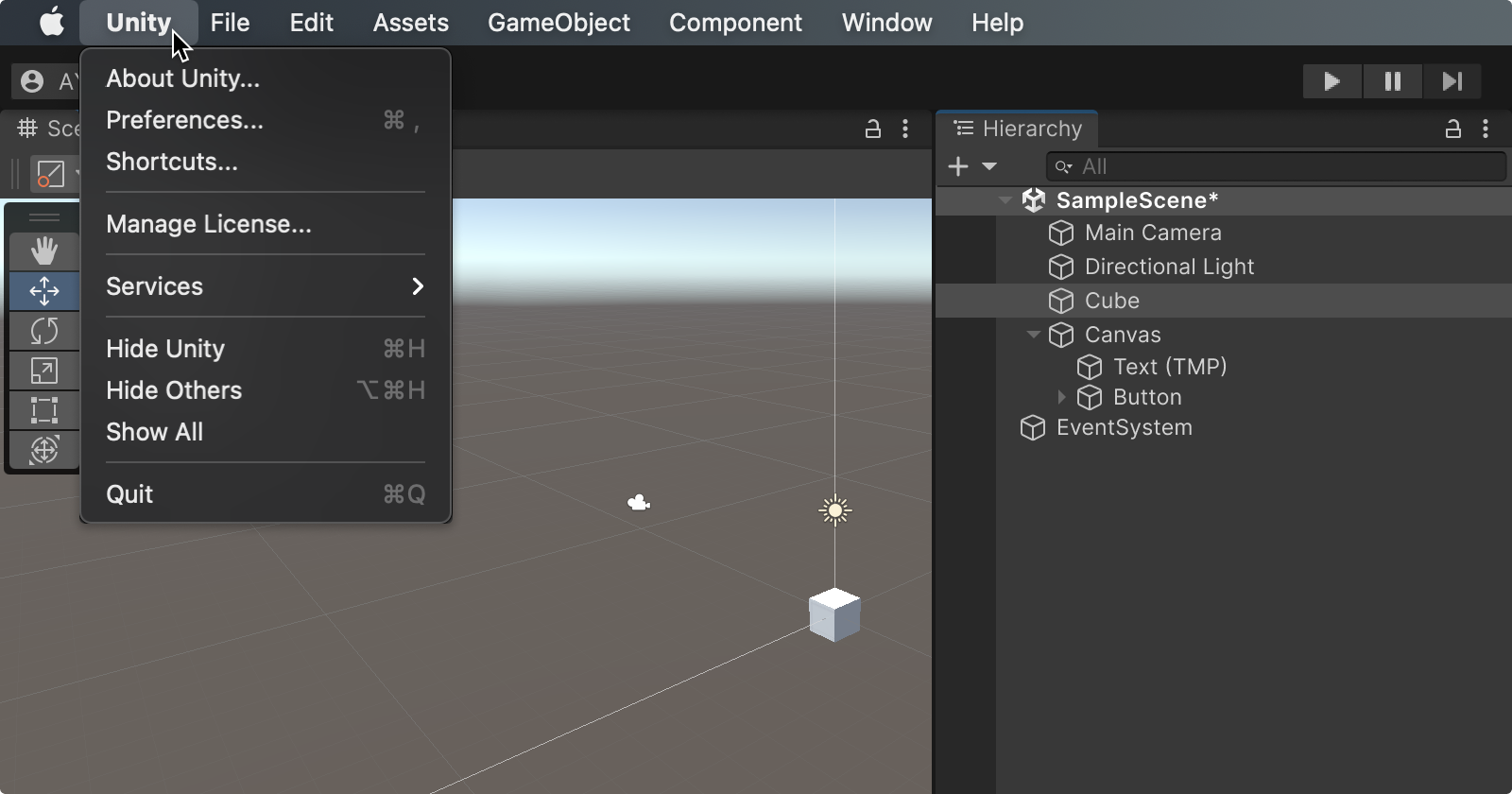
On macOS, the Preferences are called “Settings” and can be accessed from the Unity menu, instead of the Edit menu on Windows and Linux.
Some Project Settings and Preferences are related to packages and are not shown when packages are not installed/enabled.
Examples include:
Remote Config
Remote Config values are fetched at runtime by the developer’s app and used by code to adjust behavior (e.g., feature flags, difficulty, pricing).
Remote Configs are managed in Unity Gaming Services and do not affect the Project Settings or Preferences.
Addressables
Addressables use a setting asset (AddressableAssetSettings) to configure how groups, bundles, and catalogs are built and delivered.
However, that asset is not part of Unity’s Project Settings window. It’s a project asset managed by the Addressables system in its own window.
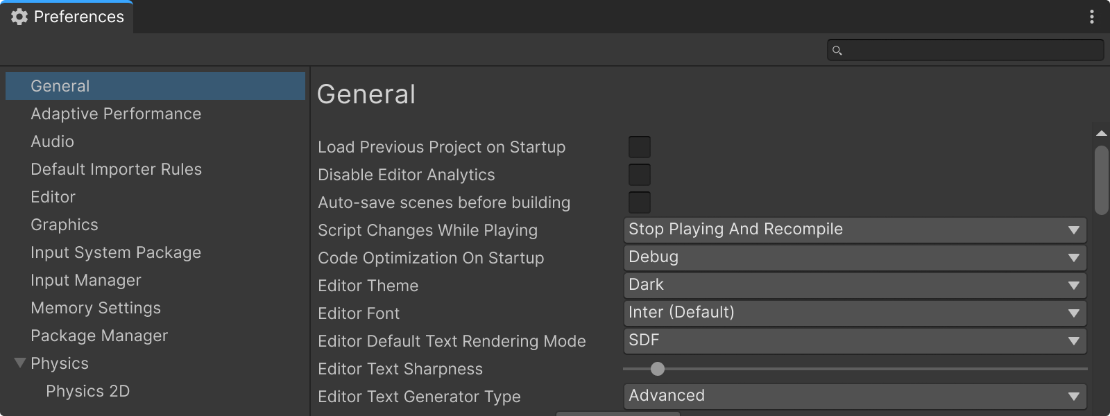
Preferences window
All parameters related to user preferences should be available through the Preferences Window. Typically, parameters that are only available through the Preferences Window are options that users set once or change infrequently (e.g., selecting an editor theme).
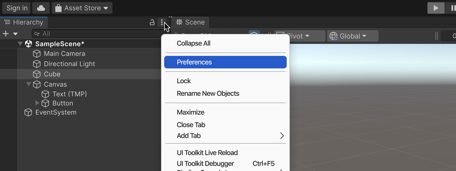
In-Context Access
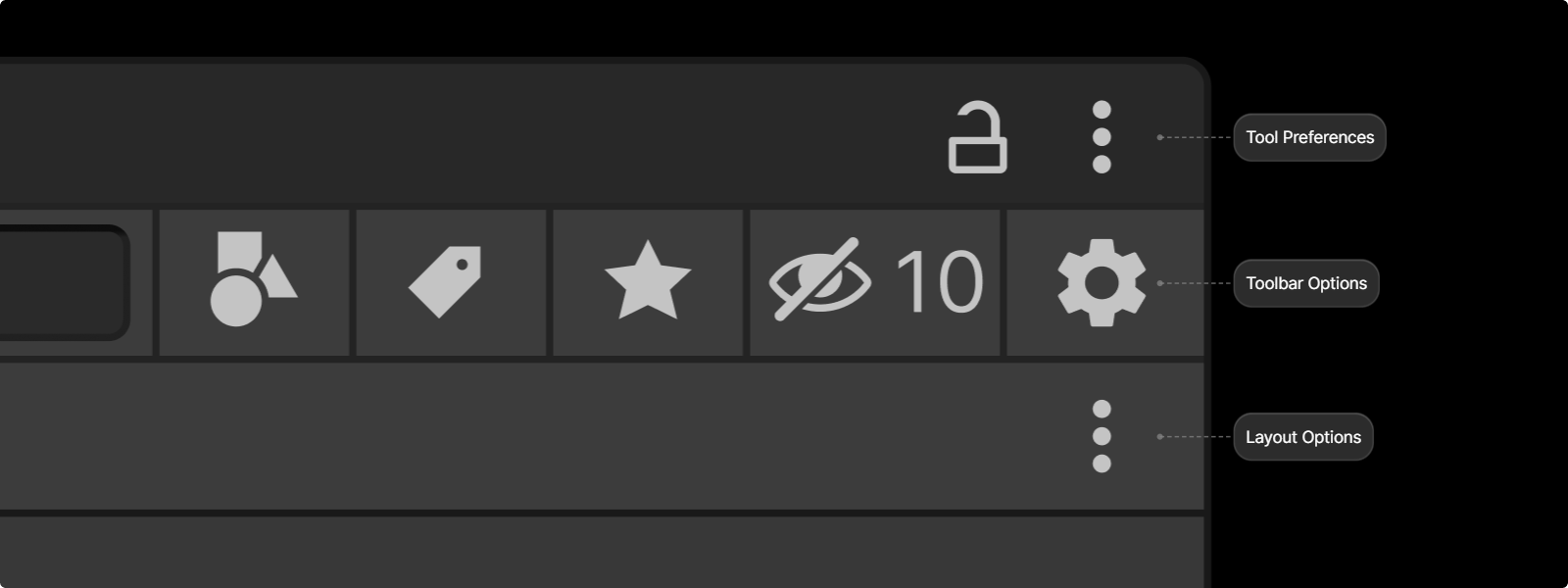
Parameters that require more frequent adjustments should also be accessible directly within the tool they affect via the contextual menu and the kebab menu (e.g., showing or hiding toolbar buttons).
Layout configurations should only be available within the context of the tool to which they apply and do not need to be duplicated in the Preferences Window (e.g., resizing or hiding table columns).
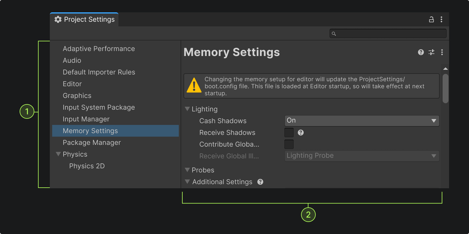
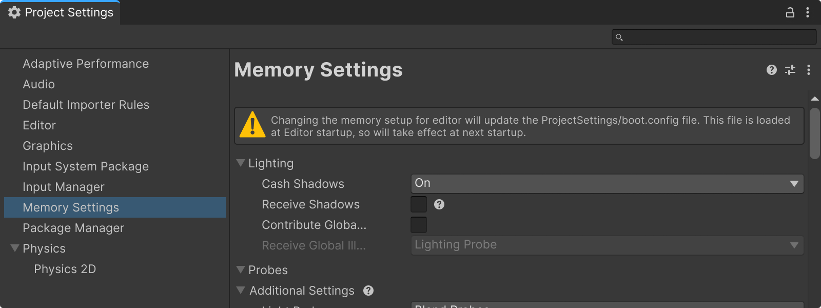
Both Project Settings and Preferences windows use a two-panel system:

Side Navigation panel.

Content Panel, where the parameters are.

Don't include "settings" in sub-page names.
Don't create a sub-page unless you have at least two sub-pages to include.
Do ensure proper grouping using foldouts.
Do use basic buttons. The buttons should hug their content (no window-wide buttons).
Don't add icons or branding to the navigation panel or the content panel.
Don't add titles to tabbed sections. The tab name is enough.
Don't add extra containers or borders for grouping and prefer foldouts.
The Tab dock kebab button must send the user to the Project settings and/or Preferences window (when the tool has associated parameters).
Within the content of the window, the kebab menu or gear icon at the toolbar level will present in-context options, but should not also be a way to access the Preferences window.
Once selected, the Project settings or Preference window opens directly to the appropriate page or sub-page.
Don't label menu item “open preferences”.
Don't label menu item “preferences page”.
Don't add an ellipsis (...) to menu item.
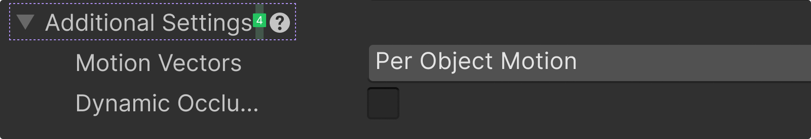
Each content page can display a help button on their title bar.

If there is a need for more precise, contextual documentation placement, use the help box or for more subtle cues, the help icon is placed inline, after the label or control (with 4px margin).
