


Menus and Entries
Menus provide access points to contextual actions, items or windows to help a user execute a function.
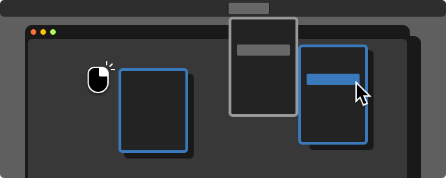

Menus provide access points to contextual actions, items or windows to help a user execute a function.

Menus provide access points to actions, items, or windows to help a user execute a function. All menus are displayed on a temporary window that draws on top of the editor surface, such as a right click menu or a drop down.

Menu types found in the editor:
Do sort items by priority
Leverage user research and feedback to identify the most used actions for that context, and prioritize those actions from the top down.
Do always allow access to submenu items
If the context makes an item open a submenu in a disabled state, the user should still be able to open that submenu and read the options. All options should display as disabled in this case.
Do not use lengthy menus
Try to reduce the number of options available per menu to ease user navigation. If a menu contains too many items, consider adding your actions to a new submenu or a new menu heading. Exceptions to this rule are menus that display user-generated items or actions, which have no cap on length.
Do group related items together
Actions that are closely related should be grouped together, and menus should use a horizontal separator to split the groups. For example, Cut, Copy, and Paste are related actions, and would be separate from any selection state actions.

Additionally, if an item fits a group but is used less often, put that item at the bottom of the group even if it sits above other more-used items that are not part of that group. For example, Paste and Paste without Formatting would both sit above Delete, even though users are more likely to use Delete than Paste without Formatting.

Repeated label prefixes:


Ensure that your label succinctly and clearly communicates the intended action or state.
Action item labels should use verbs or verb phrases such as Cut, Copy, and Share File.
Items that change a state should clearly communicate the outcome of selecting that item such as Show Object, and Hide Object.
To condense English language labels avoid using articles such as "a", "an", and "the."
When a label uses more than one word, use title casing for capitalization.
If an item in a menu will trigger follow-up actions or user input in any way, append an ellipsis (...) to the item label to indicate that the user will be taken to the next window or action item.

Items that are present in the menu but not available in the current context should never be hidden or removed. Always use the disabled text state for items that cannot be selected. If all items in a menu are not applicable to the context, display all items in the menu as disabled so the user can still view and read the menu.

Items in the menus should not be indented. Consider using a group separator or sub menu to indicate grouping or hierarchy in menu items.
States that are persistent should use a checkmark to indicate if the item is active or not active. For example, for text that is Bold, the Bold menu item will display checked, while text that is Italicized will display the Bold menu item unchecked.
A state that is mutually exclusive can use the same item row. Changing the state of the row will also change the label being displayed, in order to keep the menu shorter and easier to parse. For example, if the item Show Object is selected, upon the next open for the menu the item will be replaced with Hide Object.
Use paired item rows for a toggled state only when clarity is added. Sometimes users will benefit from seeing both states of a binary toggle at the same time. If clarity is added by displaying both states, the currently selected state should display as a disabled action since the user cannot select the same state again.
Mutually exclusive states with three or more options should use radio buttons. If a state is mutually exclusive but has more than two options, all items should be listed in a group. The currently selected state should have a radio button indicator.


Main menu (or application menu) is the global menu for the entire Editor, found at the top bar across the main Editor window. All global actions should be available using this menu, even if the actions are duplicated elsewhere.


A right click action will trigger a temporary pop up menu that displays actions relevant to a specific context.
Some items will open an auxiliary menu window with additional options, called submenus.
When a sub menu is opened, there should be 3 px of padding between the primary menu and the auxiliary menu.

What entries / items / actions go to context menu, in what order
Do limit the number of items
Contextual menus should use between 10-12 items, on average. Menus should not exceed 20 items. Groups should not exceed seven items, if they are needed. Any menu that has been reviewed and needs to exceed these guidelines must enable a search bar.
Do limit the number of submenus
Contextual menus should use one level of sub menus. Contextual menus should not exceed two levels of submenus. Any menu that has been reviewed and needs to exceed these guidelines must enable a search bar.


A temporary pop up menu that displays a list of options, triggered by a button or label that invites the user to select preferences.
Use an anchored menu when the items do not need to be visible unless being changed. If you need items to persist and be visible (for example for debugging or settings changes), use a radio button group in the UI or use a default or utility window.
Anchored menus include drop downs, window pane kebab button menus, settings pop ups, etc…
What belongs in a menu window:
Do ensure a menu window is needed
An anchored menu should have a minimum of three items to select from. If you have fewer items, explore using a toggle instead.
Do limit the number of items
Limit the number of items in the anchored menu to 7-8. If more items are needed, explore using a search pop up window instead to ease in users browsing options.
Do not use submenus
If you need multiple layers of item selection, use a search pop up window.


When hovered or selected, the item row background will use the highlight color to indicate the potential selection.

When hovered or selected, an item row that opened a submenu should use a latent selection state.

Menu windows are composed of
1 Window Frame
2 Header Row (can contain a label, quick access buttons, or a search bar)
3 Item Rows
Every item in a menu uses an item row to display content and select actions.


