Editor Foundations is the official design system for all who build experiences for the Unity Editor©.Let’s get you started ->
See what is next on our radar, contribute, and request topics to be covered by the Foundations team.View changelog ->
We encourage everyone to reach out for any questions regarding styling, control libraries, accessibility, UX best practices or report emerging API's or usage patterns from your team to be included.Connect with the team ->
Add the Editor UI toolkit libraries to your teams workspace.
Robust accessibility practices improve the usability of the Editor.
Color system to assist our users creating consistent experiences across the Editor.
Icons are visual representations that symbolize commands, devices, directories, or common actions.
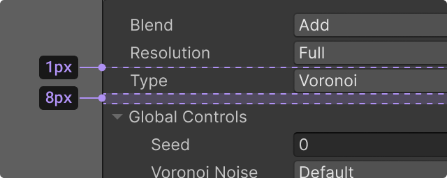
Guidance on control state indicators and interaction methods found in the Editor.
Different contexts and workflows for manipulating any type of in-game object or asset.
Recommended ways of grouping contents that contextually belong together without creating visual clutter.
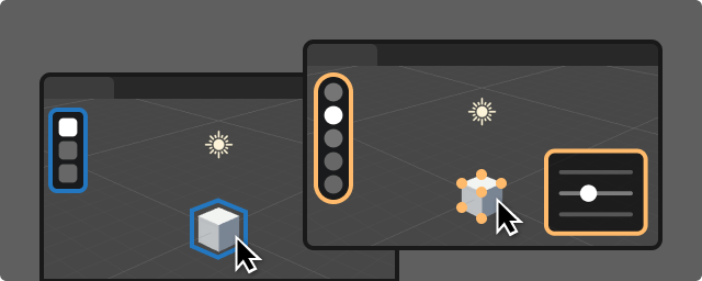
A comprehensive solution for Scene View selection, tools, and actions.
Empty states are placeholder states when there is nothing to display in a window.
A button communicates an available action in the interface and initiates the action indicated.
UIT
IMGUI
A color field allows the user to select a color and an associated alpha value to define the color’s transparency.
A dropdown is a clickable menu element that displays multiple related action options or settings.
Foldouts are collapsible sections of a user interface that hides or reveals the elements it contains.
View The Editor Icon gallery on Confluence.
confluence.com
Standards provide core foundational guidance to quality and consistency at Unity.
github.cds.internal.unity3d.com
Editor Documentation, including scripting references.
docs.unity3d.com
Get started in Figma with Editor Foundations UI Toolkit
Figma library


