Multi-column view enables the display of multiple columns in using tree or list view controls.

Implementation references
Scripting API and implementation references.
A list view with multi-column support
Docs ->
A tree view with multi-column support
Docs ->
Represents a collection of columns
Docs ->
UXML multi-column list view element
Docs ->
UXML multi-column tree view element
Docs ->
Examples of populating data and initializing cells in C# on Unity Manual
Docs ->
A general purpose class that can be used with the TreeView to create multi-column tree views and list views
Docs ->
State used by the MultiColumnHeader
Docs ->
Overview
Multi-column views enable the display of multiple columns in using tree or list view controls. They are instantiated differently in the UI Toolkit and IMGUI frameworks.
When to Use
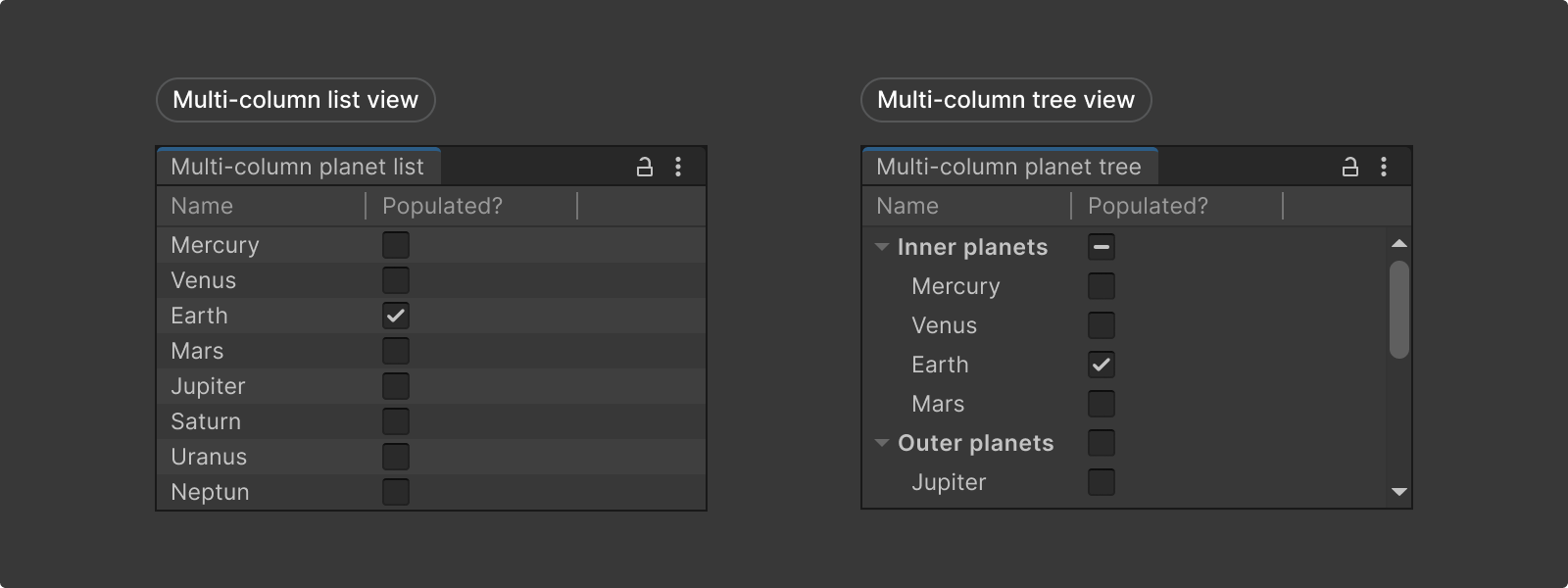
- Use a multi-column list view when displaying multiple columns in a flat list view.
- Use a multi-column tree view when displaying multiple columns in a hierarchical tree view.
Create in UI Toolkit
Multi-column views are not in the UI Builder library as of 2022.1.
To create these controls;
1. First add multi-column viewcontrols to UXML,
2. define the column data in C# and reference this object,
3. and customize using Column properties.
A list view with multi-column support.
Docs ->
A tree view with multi-column support.
Docs ->
Represents a collection of columns.
Docs ->
UXML multi-column list view element
Docs ->
UXML multi-column tree view element
Docs ->
Examples on populating data and initializing cells in C# on Unity Manual
Docs ->

Not in UI Builder library.
Multi-column views are not yet added to the UI Builder library. However you can add them as custom UXML objects and bind data in C#.
1. Add the control to UXML
To create a list or tree view with multiple columns, first create a MultiColumnListView or MultiColumnTreeView UI control, and define the number of columns and column titles in a UXML file.
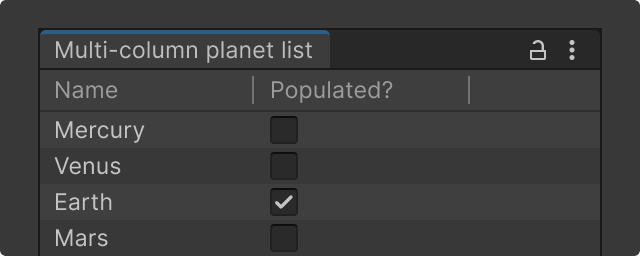
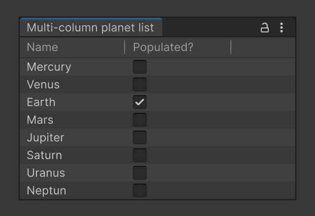
Examples below have a column with a list of planets and toggles that indicate whether the planet is populated:
Multi-column list view UXML
Add the following code in a .uxml file:
<ui:UXML xmlns:ui="UnityEngine.UIElements" xmlns:uie="UnityEditor.UIElements" xsi="http://www.w3.org/2001/XMLSchema-instance" engine="UnityEngine.UIElements" editor="UnityEditor.UIElements" noNamespaceSchemaLocation="../../../UIElementsSchema/UIElements.xsd" editor-extension-mode="False">
    <ui:MultiColumnListView fixed-item-height="20">
        <!-- Columns and Column aren't Visual Elements or controls. They are considered attributes of MultiColumnListView. -->
        <ui:Columns>
            <ui:Column name="name" title="Name" width="80" />
            <ui:Column name="populated" title="Populated?" width="80" />
        </ui:Columns>
    </ui:MultiColumnListView>
</ui:UXML>
Multi-column tree view UXML
Add the following code in a .uxml file:
<ui:UXML xmlns:ui="UnityEngine.UIElements" xmlns:uie="UnityEditor.UIElements" xsi="http://www.w3.org/2001/XMLSchema-instance" engine="UnityEngine.UIElements" editor="UnityEditor.UIElements" noNamespaceSchemaLocation="../../../UIElementsSchema/UIElements.xsd" editor-extension-mode="False">
    <ui:MultiColumnTreeView fixed-item-height="20">
        <!-- Columns and Column aren't Visual Elements or controls; they are considered attributes of MultiColumnListView. -->
        <ui:Columns>
            <ui:Column name="name" title="Name" width="120" />
            <ui:Column name="populated" title="Populated?" width="80" />
        </ui:Columns>
    </ui:MultiColumnTreeView>
</ui:UXML>
3. Customize with properties
Column class properties are used to define how a user interacts with a column in a multi-column view, and how its data and the data of each cell in this column are represented.
Callback for constructing the visual representation of the column in the header.
Docs ->
The maximum width of the column.
Docs ->
The minimum width of the column.
Docs ->
Indicates whether the column is optional. Optional columns can be shown or hidden interactively by the user.
Docs ->
Indicates whether the columns can be reordered interactively by user.
Docs ->
Indicates whether the column can be resized interactively by the user.
Docs ->
Indicates whether columns are resized as the user drags resize handles or only upon mouse release.
Docs ->
Indicates whether the column can be sorted.
Docs ->
Indicates whether the column will be automatically resized to fill the available space within its container.
Docs ->
Create in IMGUI
Multi-column views are the standard tree view control configured with MultiColumnHeader and MultiColumnHeaderState classes.
A general purpose class that can be used with the TreeView to create multi-column tree views and list views.
Docs ->
State used by the MultiColumnHeader.
Docs ->
Multi-column tree view example;
1. Create some columns using MultiColumnHeaderState and set the column properties.
var columnList = new List();

// Create 10 columns where the text of each column is its index (i)
for (var i = 0; i < 10; i++)
{
      columnList.Add(new MultiColumnHeaderState.Column
       {
           headerContent = i,
           headerTextAlignment = TextAlignment.Left,
           sortedAscending = true,
           sortingArrowAlignment = TextAlignment.Left,
           width = 100,
           minWidth = 30,
           autoResize = true
       })
}
2. Create a Column State object with the created columns
MultiColumnHeaderState columnState = new
MultiColumnHeaderState(columnList);
3. Create a MultiColumnHeader object with the state
MultiColumnHeader header = new MultiColumnHeader(columnState);
4. Create a TreeView with the MultiColumnHeader object.
TreeView treeView = new TreeView(..., header);
Multi-column list view example;
To create a list view follow the same steps above for the multi-column tree view but ensure all view items are located under the root to make it a listview (so that there are no hierarchical relationships).


